Zoe Financial's money movement was built one transfer type at a time. Deposits worked differently from withdrawals, wires had their own interface, and ACATS lived in a separate flow entirely. I redesigned the system so six transfer types could share one interaction model, across desktop and mobile, under U.S. financial compliance.

Zoe Financial's money movement was built one transfer type at a time. Deposits worked differently from withdrawals, wires had their own interface, and ACATS lived in a separate flow entirely. I redesigned the system so six transfer types could share one interaction model, across desktop and mobile, under U.S. financial compliance.

6 → 1

Transfer types unified under one interaction model Each with different compliance, data, and approval requirements.

$360M

Processed through the new transfer system Across deposits, withdrawals, wires, ACATS, and internal transfers.

+42%

Transfer volume growth, year one No marketing push ran in parallel — the lift came from the redesigned flows.

What was actually broken.

Zoe had one transfer type, desktop deposits and needed five more. The architecture couldn't absorb them. Every new type meant a new screen, and clients would have to learn each one.

No mobile support either, in a product where clients increasingly managed money from their phones.
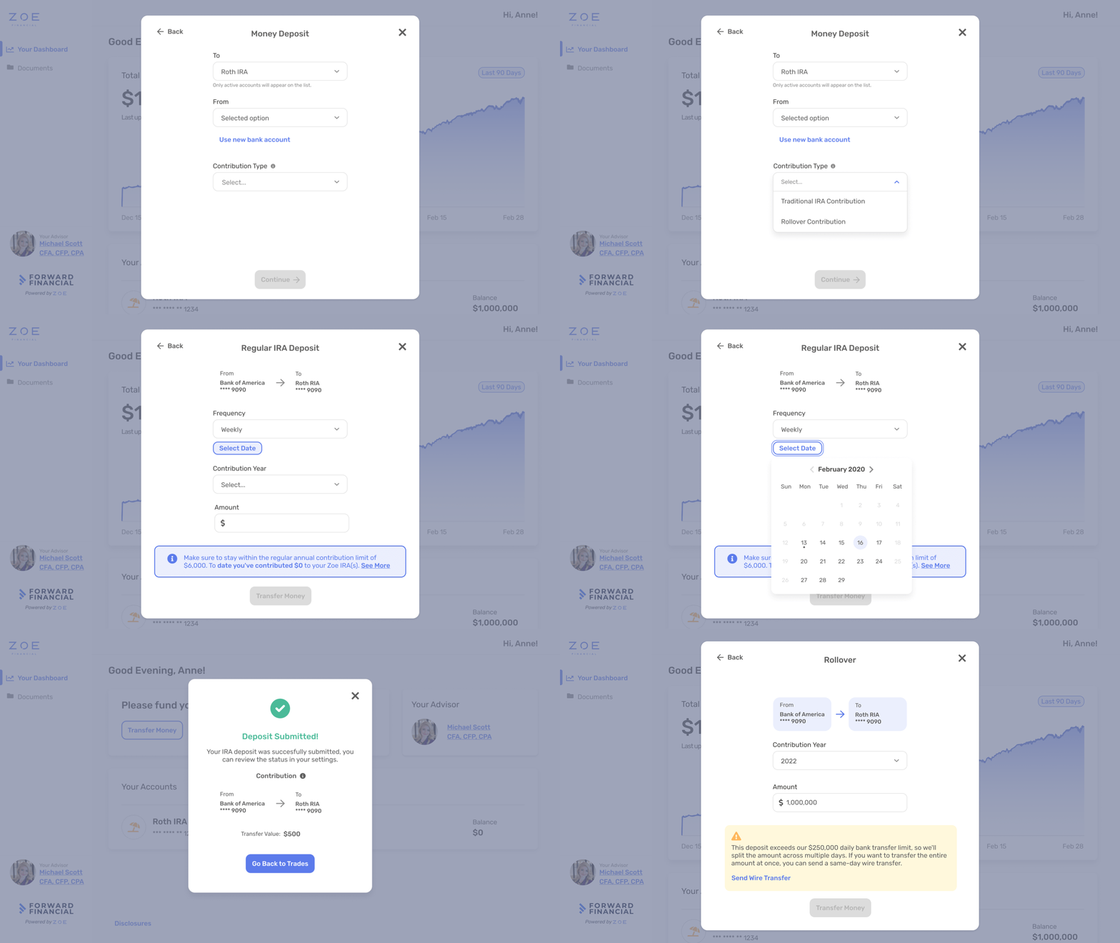
Three constraints shaped every decision.

Compliance

ACATS needs broker authorization. IRA deposits need contribution year and limit tracking. Wires need recipient verification. Legal requirements, all inside one system.

Team

Me, one PM, one FE, one BE, one QA. No design system.

Scope kept growing

Three sprints on paper. Two years in practice. Wires, checks, ACATS, Internal Transfer, then Bulk Transitions

From/To on the left. Everything else on the right.

From/To on the left. Everything else on the right.

Every transfer answers the same question: pick a from and a to. Those two live on the left, always.

Everything else — amount, frequency, compliance, disclosures — lives in a dynamic right panel that reshapes based on the pair.

Every transfer answers the same question: pick a from and a to. Those two live on the left, always.

Everything else — amount, frequency, compliance, disclosures — lives in a dynamic right panel that reshapes based on the pair.

Same skeleton, different surfaces.

Earlier flows were limited to desktop. The redesign treated mobile as the primary platform, shaping the structure, hierarchy, and interactions before extending them to larger screens.

Two things surprised us after launch.

Most ACATS transfers aren't started by clients

Most ACATS transfers aren't started by clients

Client success runs them. We built for the wrong audience.

70% of withdrawals come from advisors, not clients.

70% of withdrawals come from advisors, not clients.

The audience could handle more density than we shipped.

What shipped and what it changed.

+42% volume, year one

No marketing push. Faster flows plus mobile as a new platform.

$360M+ processed

Every new type inherited the pattern immediately — no ramp-up.

Fewer support escalations

Inline validation caught issues before submission, not after.

Reused for Bulk Transitions

The system was reused wholesale for the advisor bulk-transfer feature. Unplanned.

User demand drove native iOS

User demand drove native iOS

Mobile web usage justified a native app. I designed it end-to-end.

Create a free website with Framer, the website builder loved by startups, designers and agencies.